Breeze Cart
Breeze Cart is an e-commerce company that sells products through their mobile web platform. They are looking to enhance the browsing and checkout experience to significantly improve the usability of their products.
My Role
I was the project lead and sole designer in charge of UX design and UI design.
Problem
High Abandonment Rates at Item Page and Cart Checkout
Description:
70% of users who place an item in the cart do not complete the purchase. Data indicates that users tend to abandon the cart at the registration page because they are required to create an account to make a purchase.
Solution:
Guest Checkout: Introduce a guest checkout option to streamline the purchasing process. Users should have the choice to complete their purchase without the obligation of creating an account.
Goals:
Increase Cart Conversion: By introducing a guest checkout, the aim is to reduce cart abandonment rates and improve the conversion rate, ultimately leading to more successful purchases.
Step 1: Discover
As the app enters a competitive market, it is crucial to understand user preferences and experiences and analyze the app's strengths and weaknesses compared to its competitors.
Research:
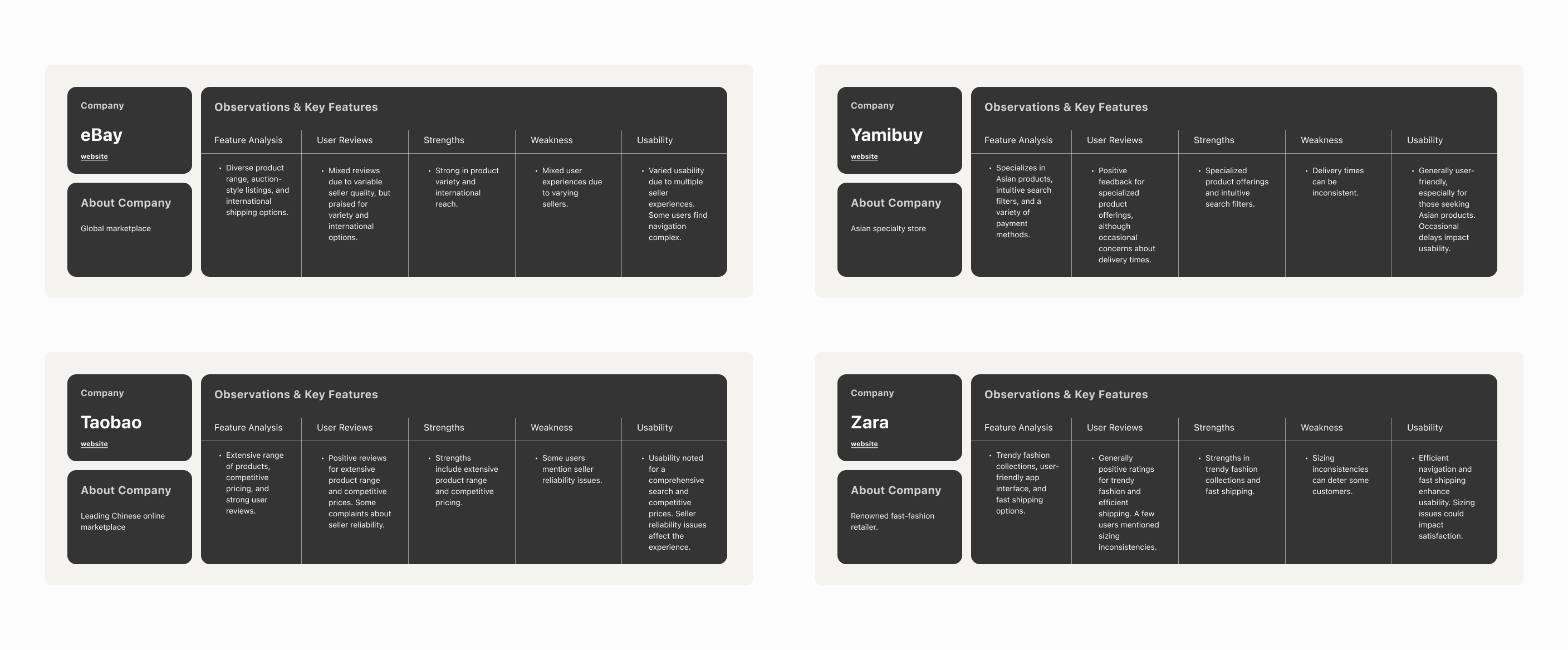
The objective of this research is to investigate user preferences and experiences with the Breeze Cart App and to conduct a competitive analysis by comparing the app's features, usability, and overall performance with similar shopping apps.
The goal is to improve the conversion from browse to completion of checkout to increase revenue on the product’s mobile-web experience.
Research Questions:
- What are the key features of the Breeze Cart and other online shopping apps that users find most appealing?
- What challenges do users encounter while using the app, particularly during the shopping and checkout processes?
- How does the Breeze Cart compare to its competitors regarding user satisfaction, ease of use, and unique selling points?
Competitive Analysis
The objective of this research is to investigate user preferences and experiences with the Breeze Cart App and to conduct a competitive analysis by comparing the app's features, usability, and overall performance with similar shopping apps.
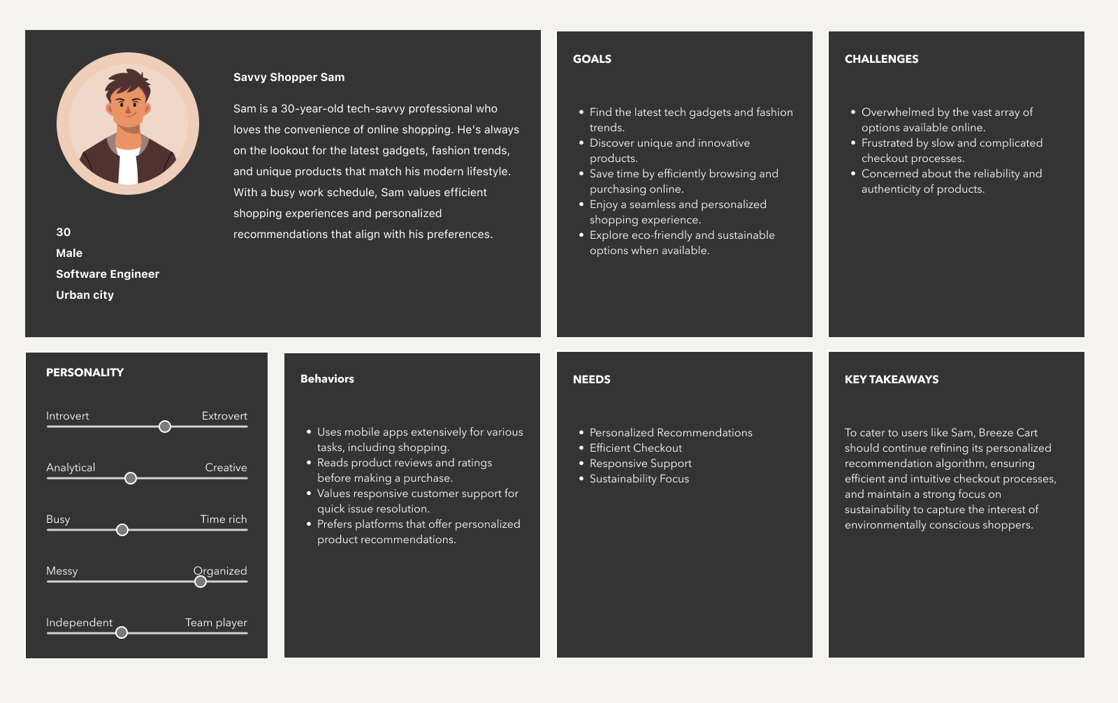
Persona
After conducting thorough research and analysis, a comprehensive user persona has been meticulously developed to represent the ideal customer archetype for Breeze Cart.
Step 2: Design & Validate
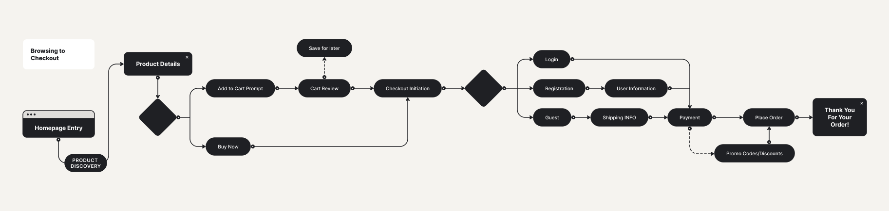
User Flows
The checkout user flow has been meticulously designed and structured based on a comprehensive understanding of the user persona, "Savvy Shopper Sam," and the specific pain points and preferences identified during the research phase.
By aligning the checkout user flow with Sam's goals and requirements, Breeze Cart aims to enhance the overall user experience, increase conversion rates, and, most importantly, cater to the needs of its target audience effectively.
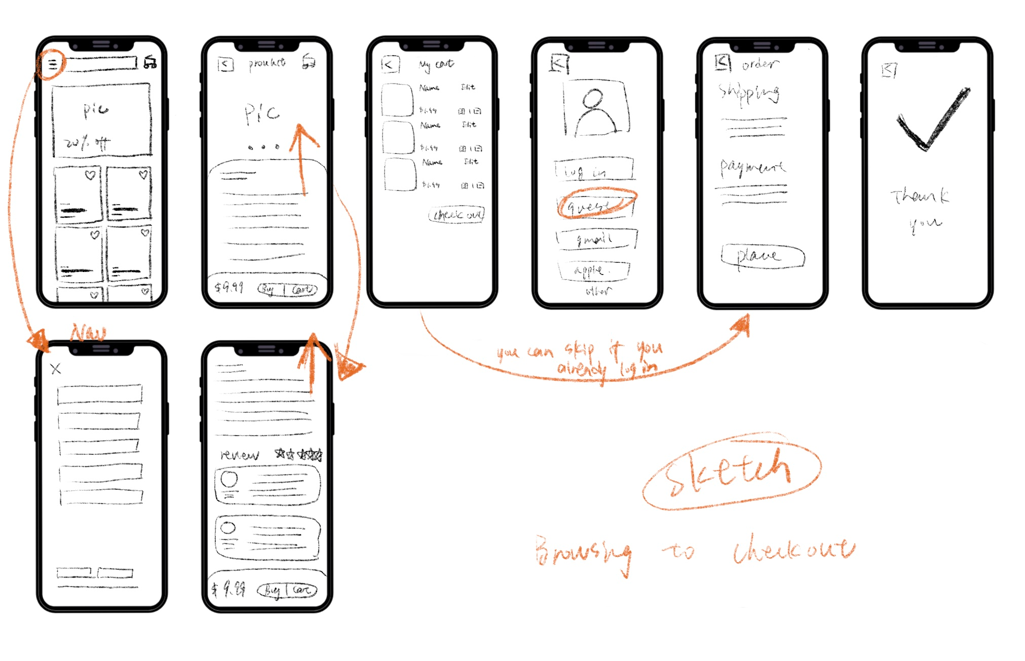
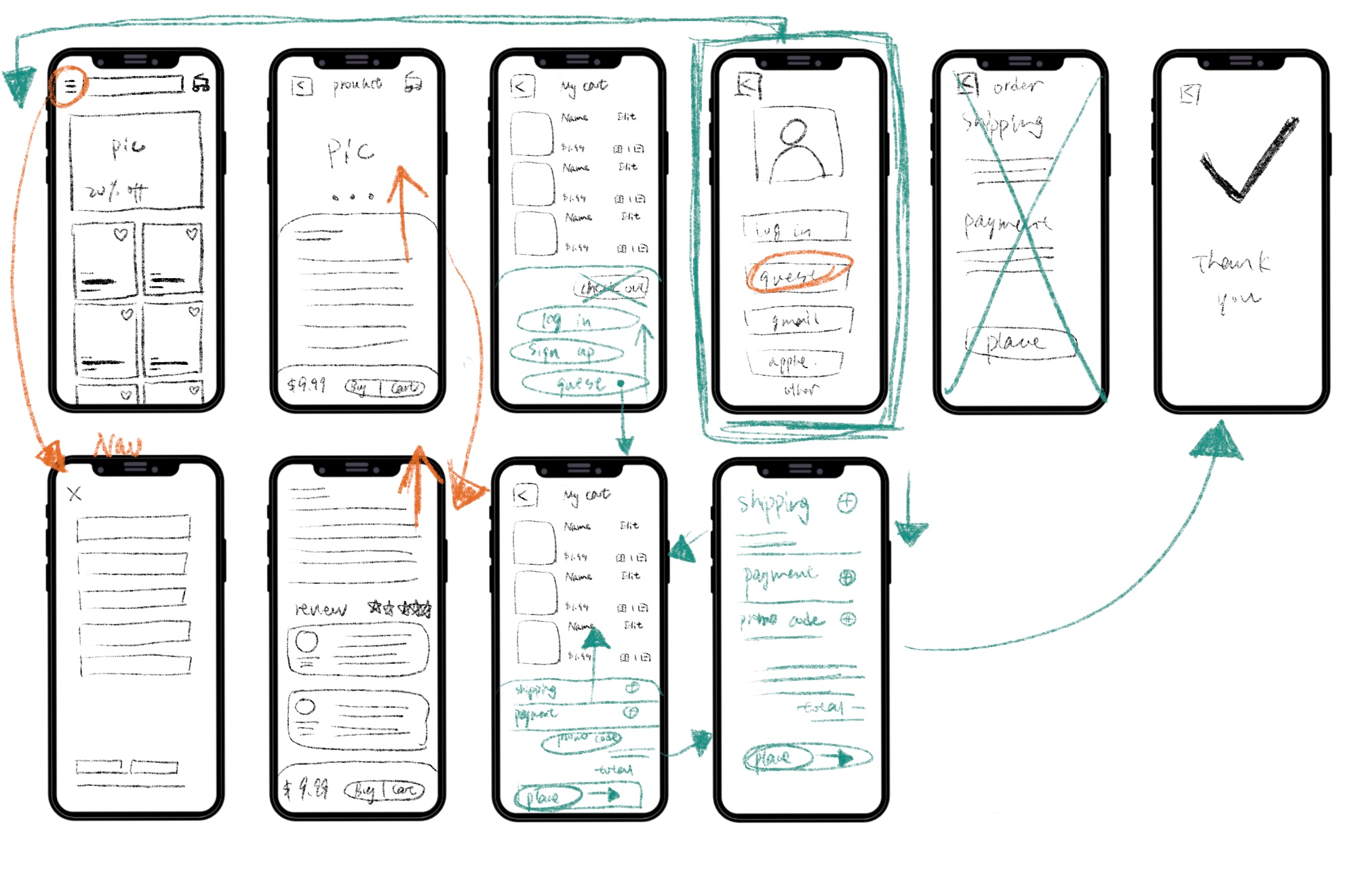
Sketch
This sketch outlines the primary steps involved in the checkout user flow, emphasizing the inclusion of a guest checkout option. Additionally, user testing and feedback can further refine this flow to meet the specific needs and preferences of Breeze Cart's target audience.
First-Round Usability Test
The usability testing focuses on evaluating the browsing to the checkout process for the Product within the Breeze Cart application. The aim is to identify user experience issues and provide recommendations for enhancing the overall flow and usability.
Findings:
- Checkout Process Flow: The majority of participants found the checkout process needs to be more intuitive and user-friendly.
- Guest Checkout: Users valued the option for guest checkout but were unsure about the benefits of creating an account.
Recommendations:
- Enhance Account Creation Prompt: Clarify the advantages of creating an account, emphasizing faster future checkouts and order tracking.
- Streamline Payment Entry: Simplify credit card and payment details entry to minimize friction during the checkout process.
- Interactive Product Images: Implement image zoom functionality to provide a closer view of product details.
- Promo Code Clarity: Clearly label the promo code field and provide real-time validation feedback.
Note: Click here to full test script.
Sketch update
The updates in this sketch reflect the iterative design process driven by usability testing results. The focus is on simplifying the user experience, clarifying instructions, and making the checkout process as intuitive and user-friendly as possible.
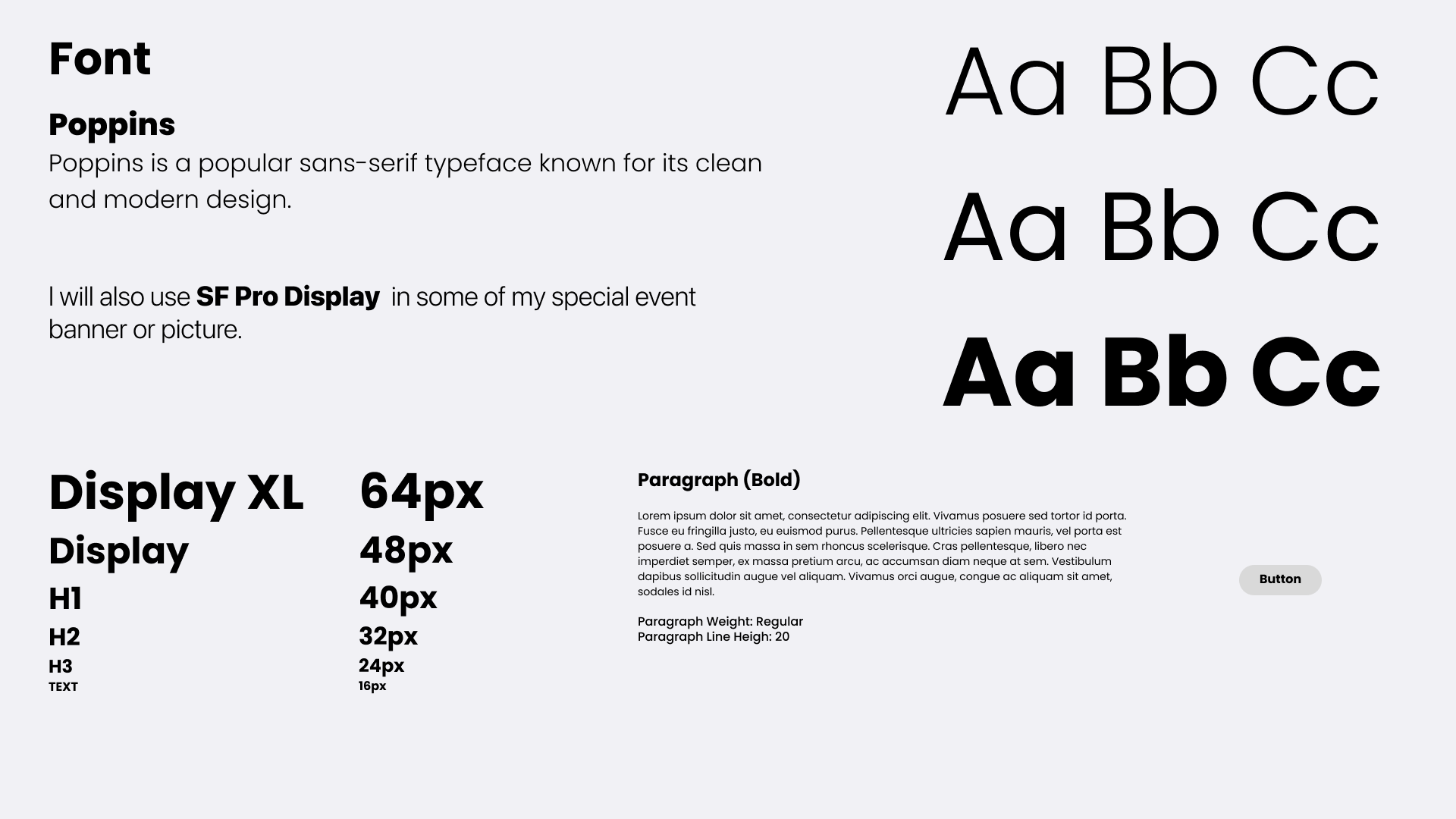
Style Guide
This guide is designed to make creating consistent and user-friendly designs. I keep it simple and easy to understand.
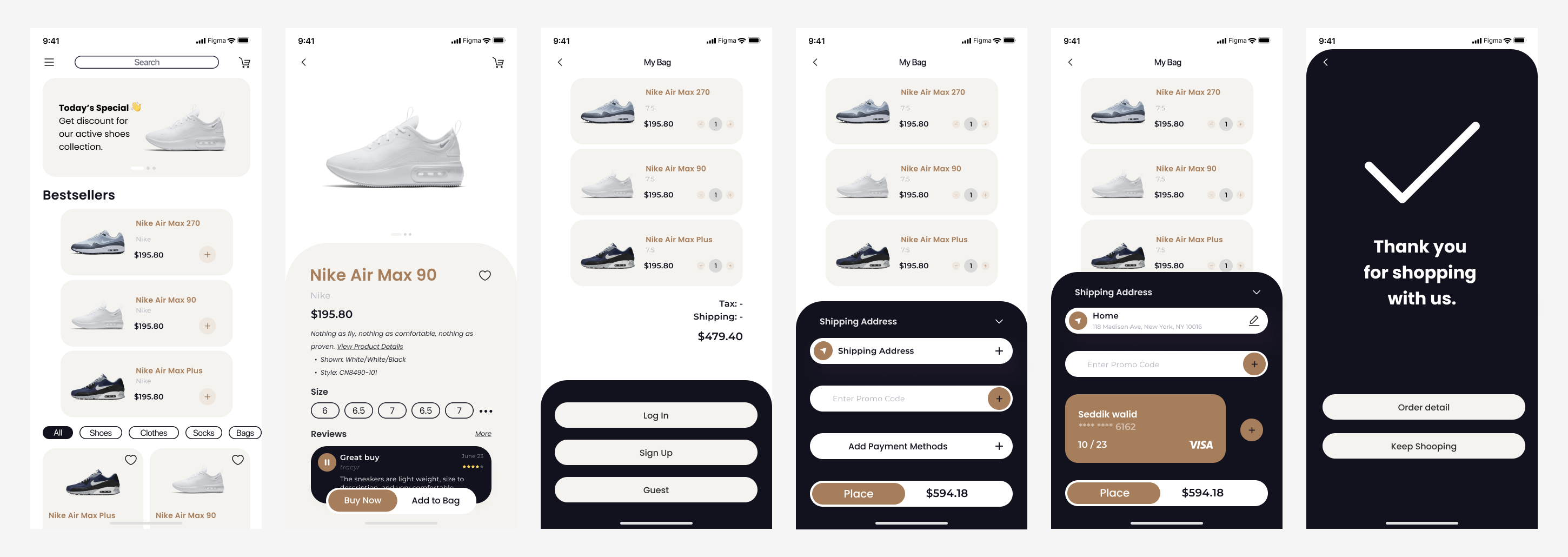
High Fidelity Designs
To enhance the checkout process and make it more user-friendly, I consolidate all the essential information onto a single screen, eliminating the need for users to navigate between multiple pages. Now, users can easily view and edit their order details, shipping information, and payment details within a unified interface.
I also implement a draggable bottom box feature, allowing users to access more information effortlessly without leaving the checkout page. Moreover, I offer guest checkout functionality, recognizing its value for new customers. This approach significantly reduces friction for first-time shoppers, as they can complete their purchase without the requirement to create an account beforehand.
Second-Round Usability Test
The second round of usability testing demonstrated significant improvements in the checkout process. Participants experienced fewer usability issues, expressed greater confidence, and provided positive feedback on the enhanced clarity and user-friendliness. Changes made since the first round have been effective in enhancing the overall user experience.
Findings:
- Reduced User Hesitation:
Compared to the first round of testing, participants showed less hesitation during the checkout process. The changes made since the initial test seemed to have reduced confusion.
- Enhanced Payment Entry Flow:
Participants found the payment entry flow to be more intuitive and efficient. The revised layout and form fields received positive feedback.
Note: Click here to full test script.
Prototype

What i Learned...
The project highlighted the concept of continuous improvement. Even after addressing major issues, there is always room for refinement and enhancements based on user suggestions.
Feedback from participants provided a wealth of insights. It demonstrated that gathering and acting upon user feedback is a continuous and invaluable part of product development.